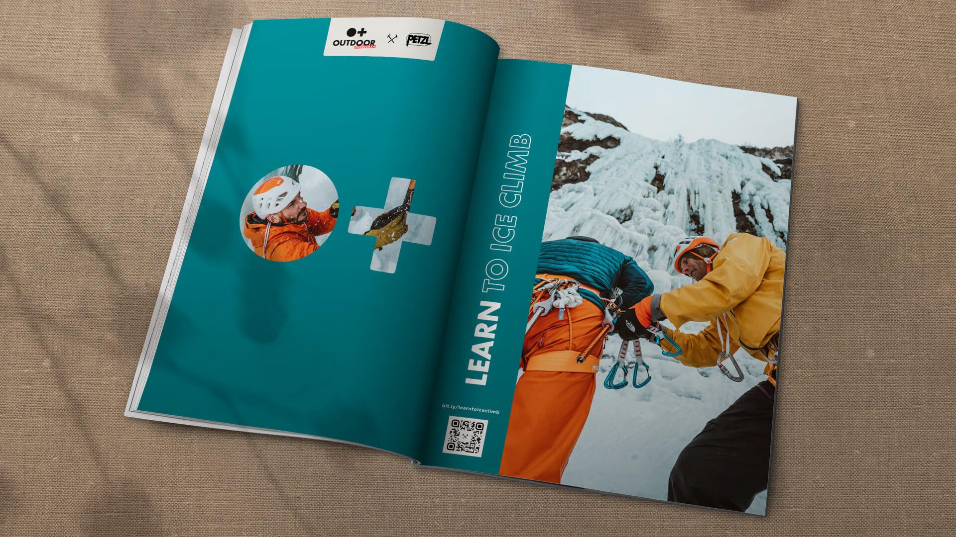
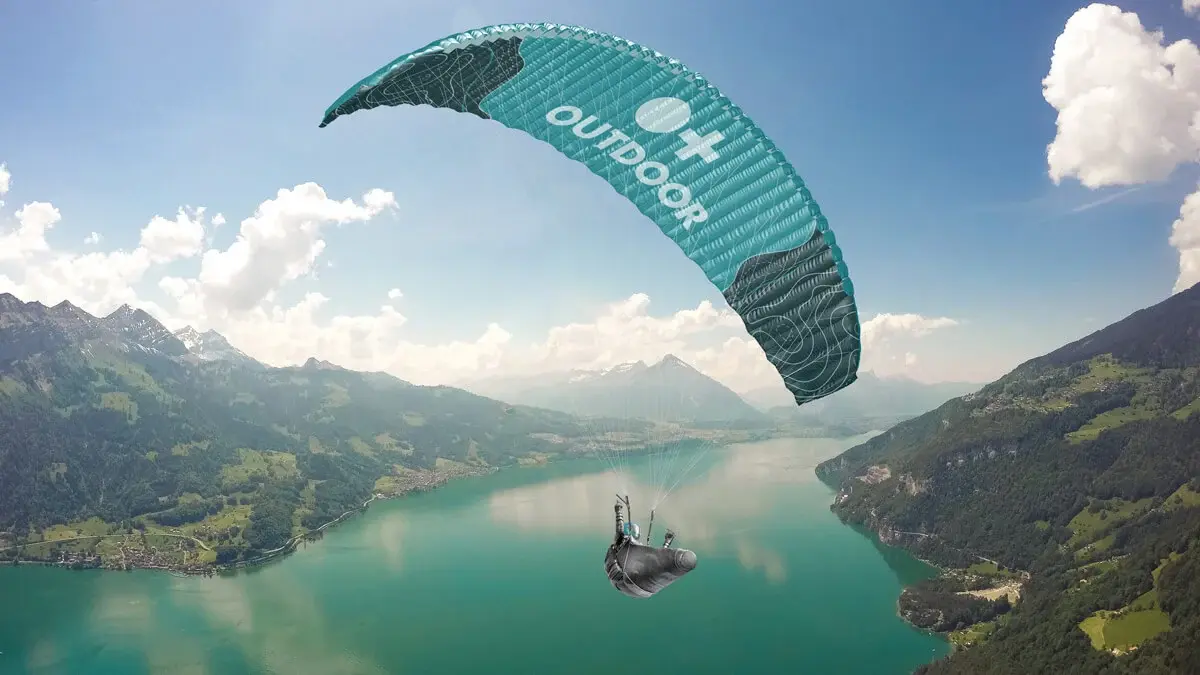
Color is a powerful means of recognition, helping establish a clear identity and distinction for Outdoor and our products. At the heart of our brand is Outdoor Teal. Inspired by Swiss glacial lakes, Teal is balanced, cool, and constant. It is stable, reliable and trustworthy.
Teal requires little to no adjustment of the eyes, providing the perfect contrast to our products, which are visually intense and exciting.
Our color palette is simple and impactful. It includes Outdoor Teal, black, white and Gray. In addition to the colors inherent within photography, these are the only colors to be used in our brand communications. This concise palette of colors will help increase visual impact and overall brand recall.
Each experience should be dominated by black, white, gray, and our Outdoor Teal, allowing our imagery to bring vibrance.
Red is generally reserved for danger/stop/warning etc. However, red is also extremely important to Switzerland's branding along with being the offical Swiss Ski School color and the color of our Jetboats.
Important: Only use Outdoor Red for Ski School and Jetboat applications
Having multiple grays gives each design the opporunity for subtle and meaningful moments of color.
Color specifications are different across various media applications, it is important to use the correct color mode for the specific media application to achieve the intended color values.


